McAfee
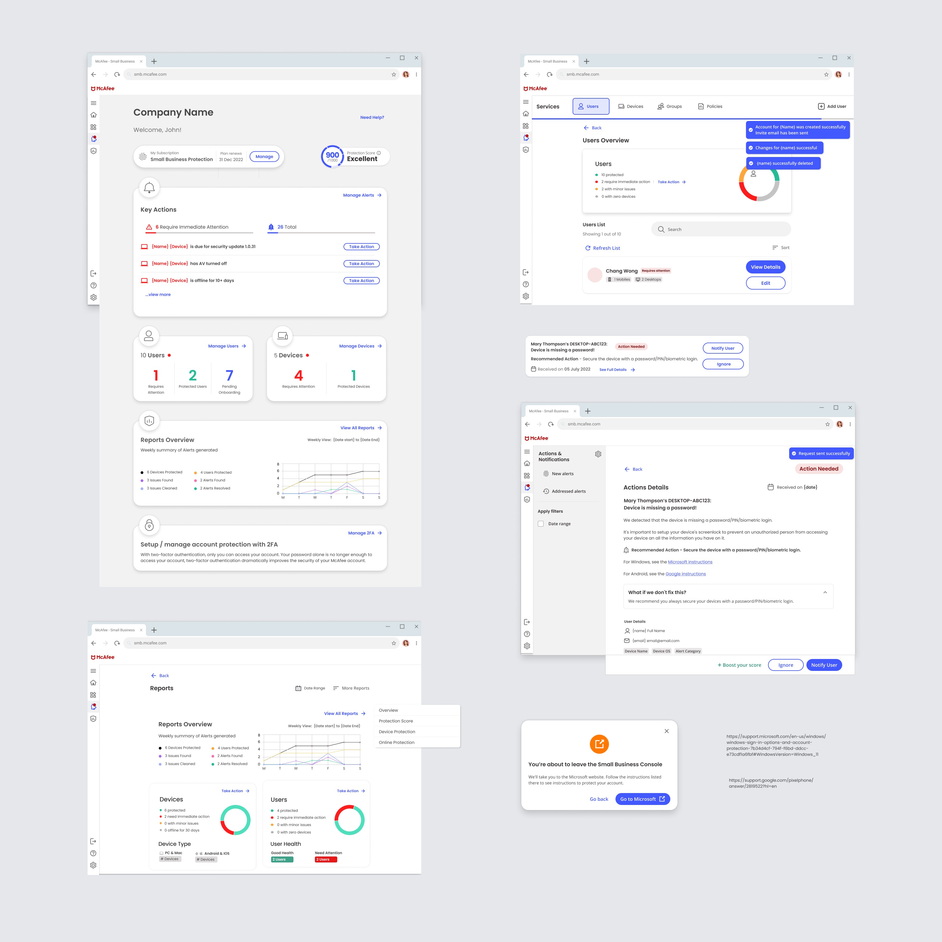
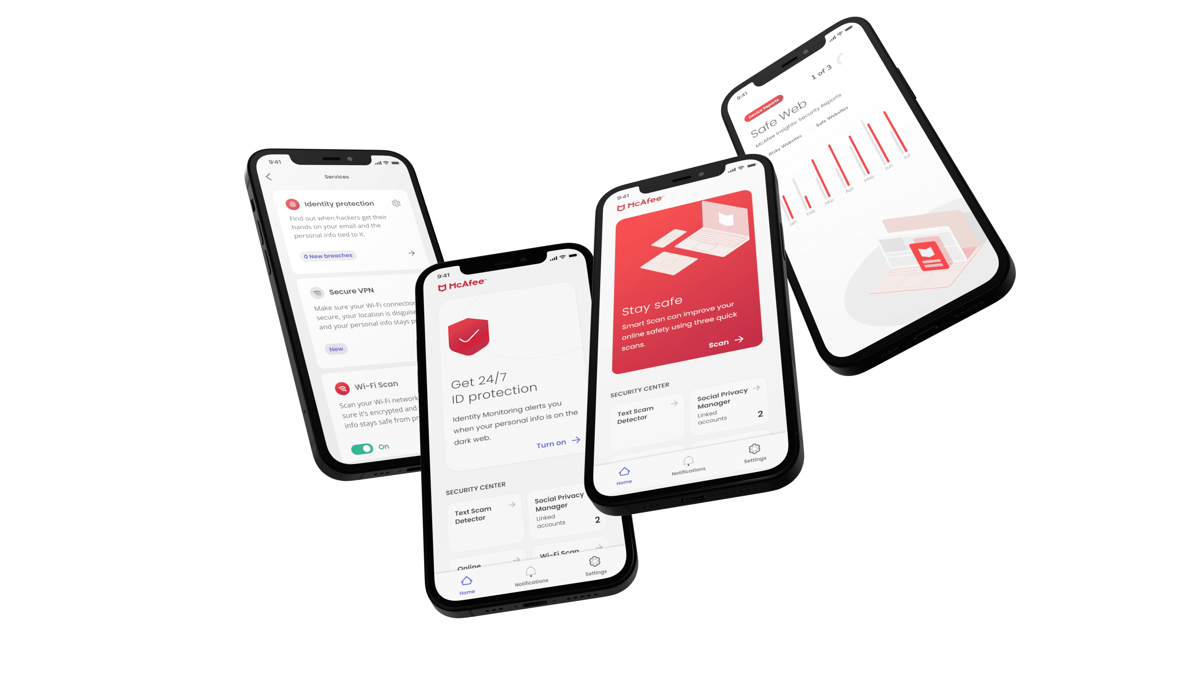
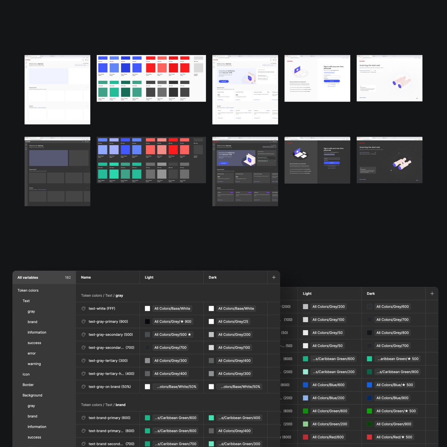
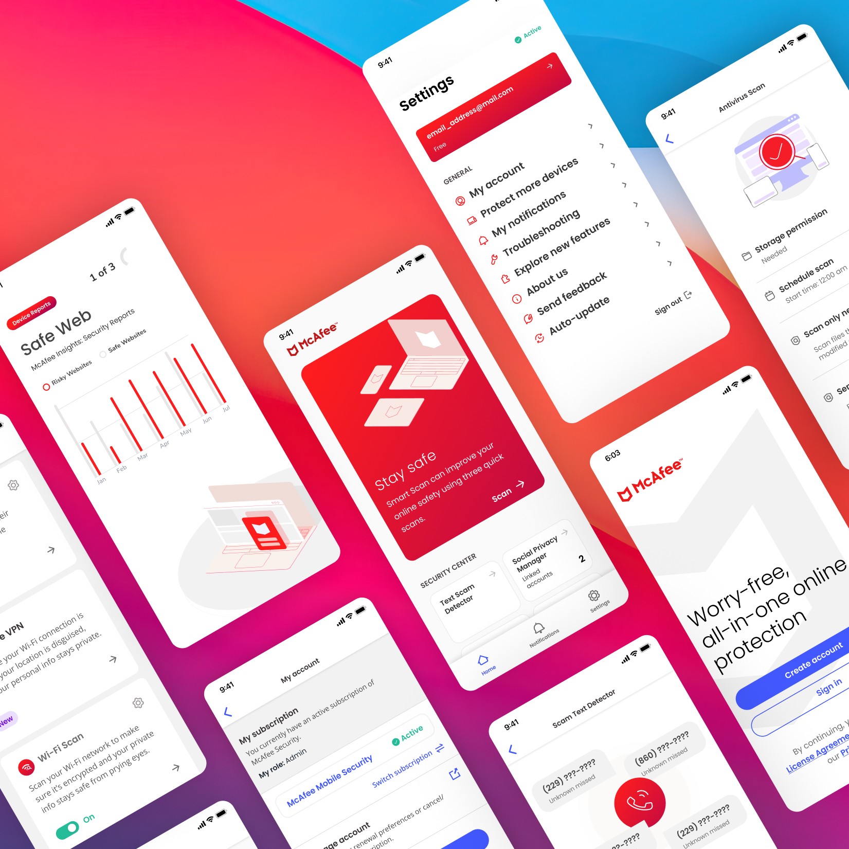
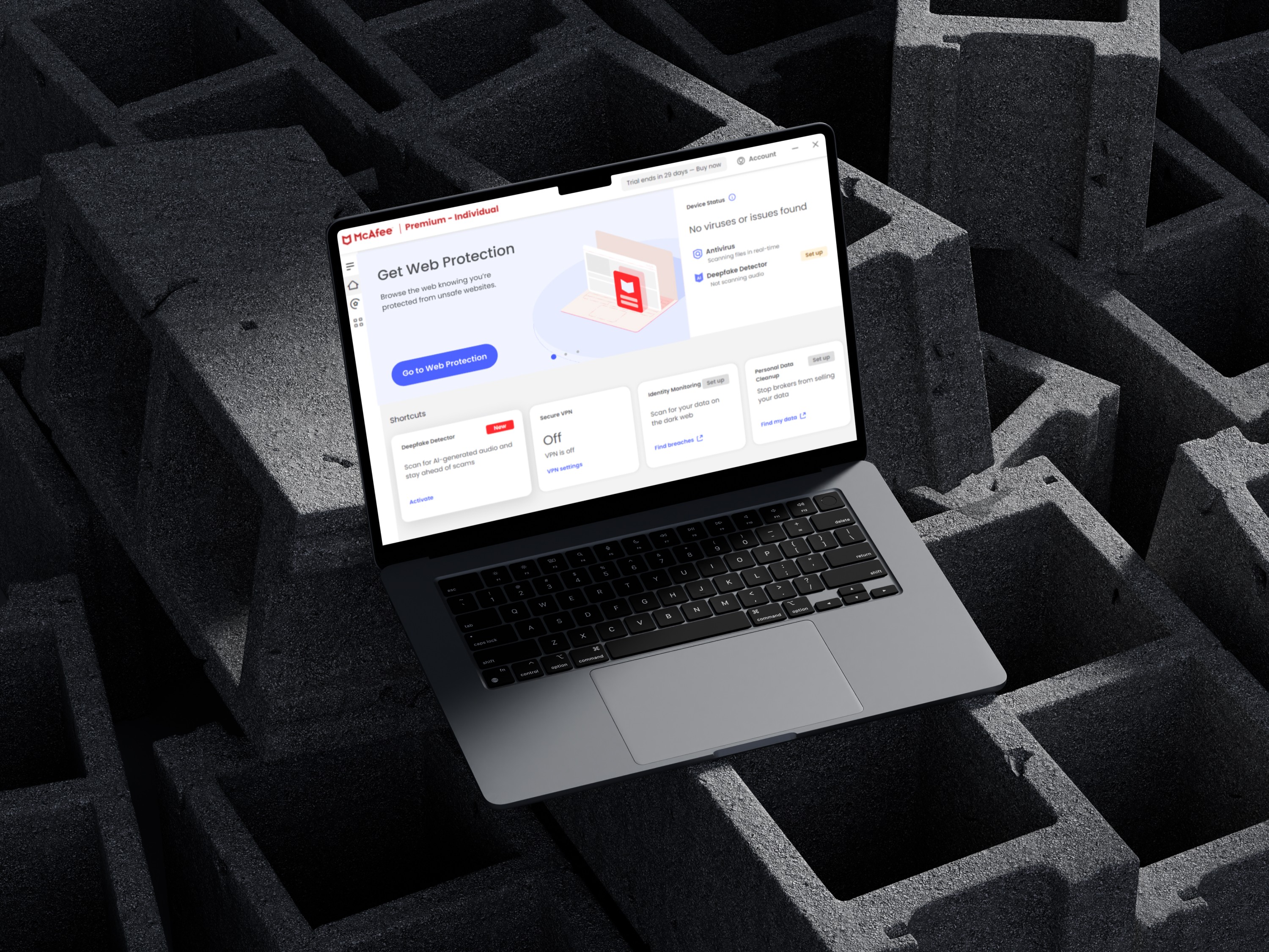
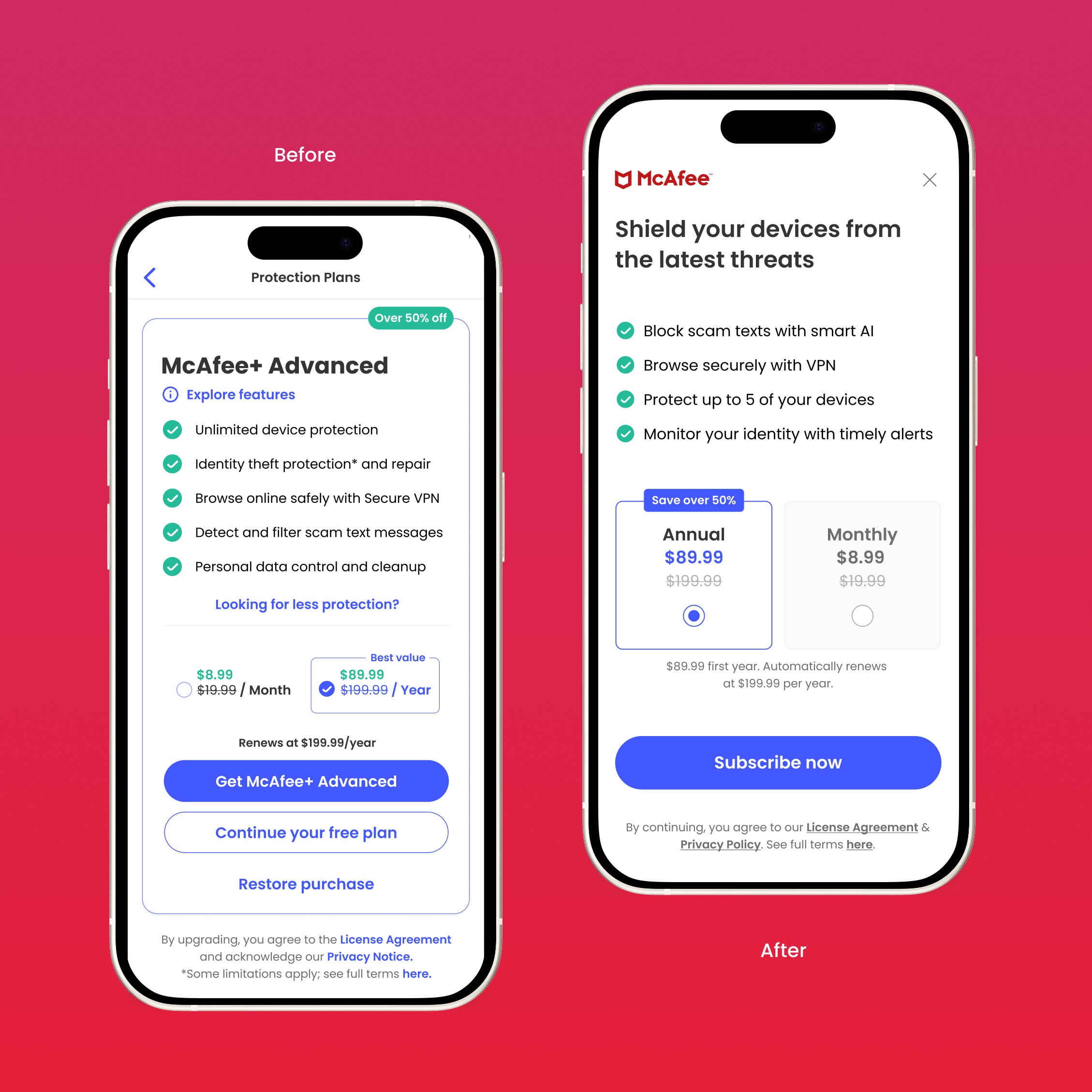
Global Security Platform Bringing together fragmented products under one scalable, consistent design system — across desktop, mobile, and every user touchpoint.

Details
Partner
McAfee
Space
Cybersecurity
Timeline
12 months
Mission?
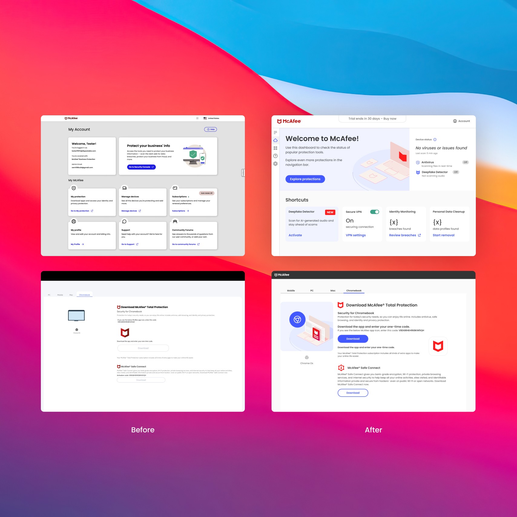
Reimagine the McAfee ecosystem into something cohesive, intuitive, and scalable for global users. Here’s how we transformed a scattered experience into a seamless one.
Role
Product Designer


Types
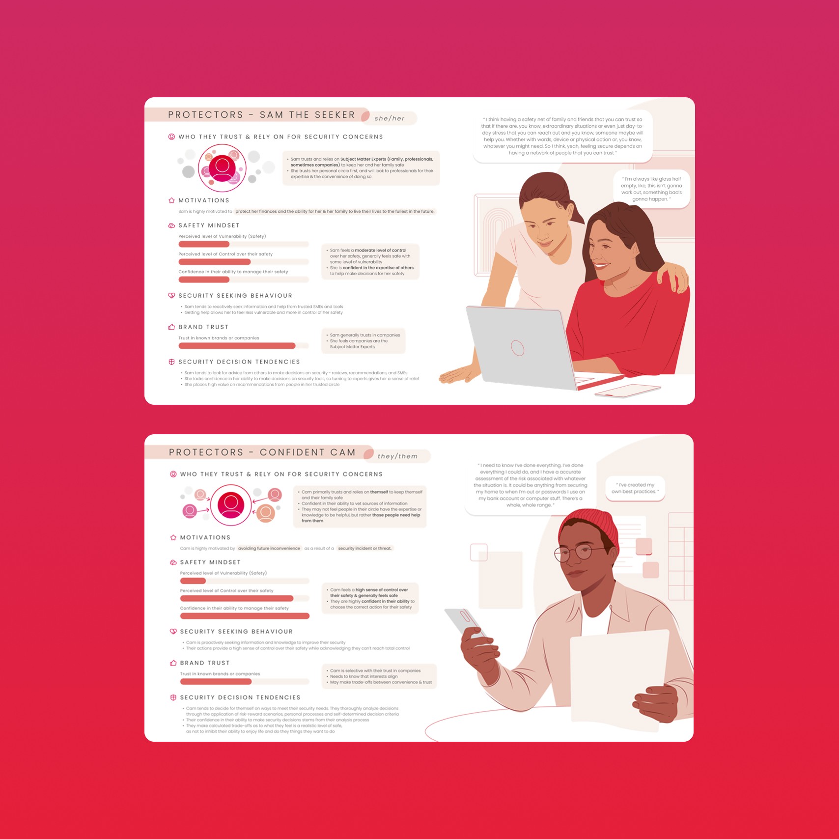
Sam the Seeker
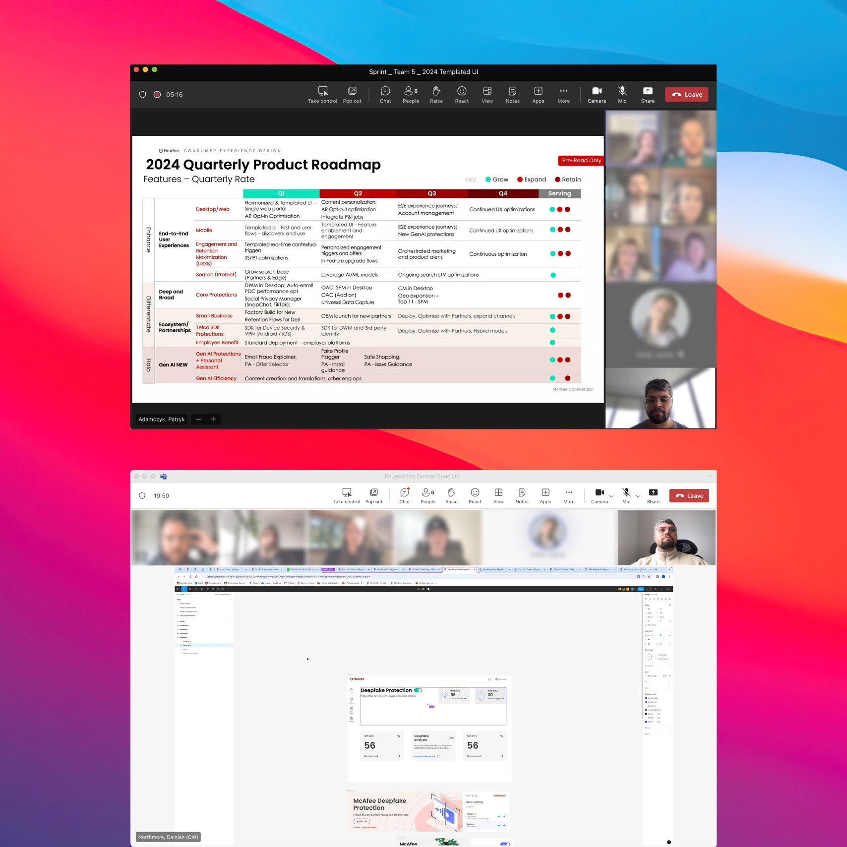
This wasn’t a solo mission. Success depended on deep collaboration:
Confident Cam
Prefers control, data, and customization.
Metrics
Error rates
-35%
User Satisfaction
+23%
Engagement
+12%
Support tickets
-21%
Onboarding time
-43%
Next projects
Piere
Fintech Software
Univers
Hotel Management