Piere
Designing a mobile-first finance experience that makes splitting, tracking, and managing money effortless — even in the most chaotic social situations.

Details
Partner
Univers Tech
Space
Financial
Timeline
14 months
Mission?
I conducted user research to gather insights for the app's features and designed smooth user flows for a seamless experience. I created detailed UI designs with a consistent style and worked closely with developers to make sure the designs were implemented correctly. I also built a design system to keep the app consistent and scalable.
Role
Product Designer
✍️ Introduction
Piere was created for a generation that treats money as social. Not just budgeting — but pooling, splitting, and coordinating purchases across moments like birthdays, dorm meals, and road trips. The challenge? These moments are messy. Our goal was to turn that mess into something smooth, even delightful — within a bold, mobile-native experience.

🔎 Problem
Splitting money among friends seems easy until real life kicks in. Someone forgets who paid. The receipt goes missing. Half the group used cash. The other half doesn’t respond. And suddenly, what should’ve been simple becomes awkward. Traditional finance apps weren’t made for these fluid, social spending moments.


🎯 Vision
We imagined a mobile app that treats group money like group chats. Where transactions are shared, not buried. Where receipts turn into tappable stories. Where AI helps everyone stay in sync — and no one feels left out.
🎯 Vision
We imagined a mobile app that treats group money like group chats. Where transactions are shared, not buried. Where receipts turn into tappable stories. Where AI helps everyone stay in sync — and no one feels left out.
🔧 Design process
We began with in-person observation. In dorm rooms, coffee shops, and road trips, we watched how people actually handled money together. The problems weren’t in the tools — they were in the emotions and friction between people. We partnered with students in Florida and New York to test early prototypes. Using Maze and Zoom sessions, we iterated rapidly. Every button placement and word choice came from how users acted, not what they said.


📱 Core solutions
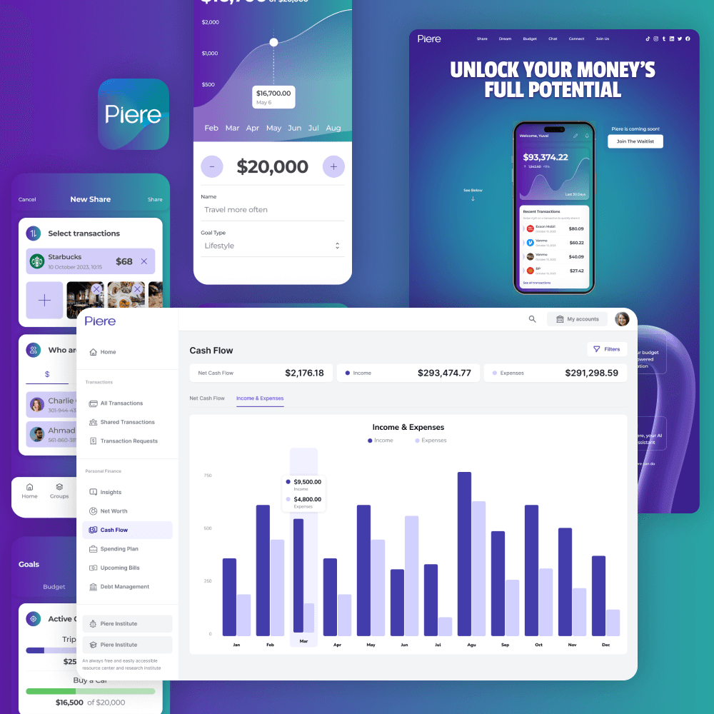
Instead of building a calculator, we built an experience. Users could tap a transaction, select friends, and instantly create a shared moment around it. With AI-powered receipt scanning, items were extracted and displayed in a tappable format. Everyone could just tap what they ordered — no math required. For recurring group needs, like rent or birthday gifts, we introduced shared money pools with contribution tracking.


👤 Personas
Erica is 19. She’s social, but hates chasing friends for paybacks. Luis is 23, plans all the road trips, and just wants budgeting to feel effortless. For Erica, we made sure Piere felt friendly and low-pressure. For Luis, we offered clarity and structure without taking away flexibility.
👤 Personas
Erica is 19. She’s social, but hates chasing friends for paybacks. Luis is 23, plans all the road trips, and just wants budgeting to feel effortless. For Erica, we made sure Piere felt friendly and low-pressure. For Luis, we offered clarity and structure without taking away flexibility.


🎨 Visual design
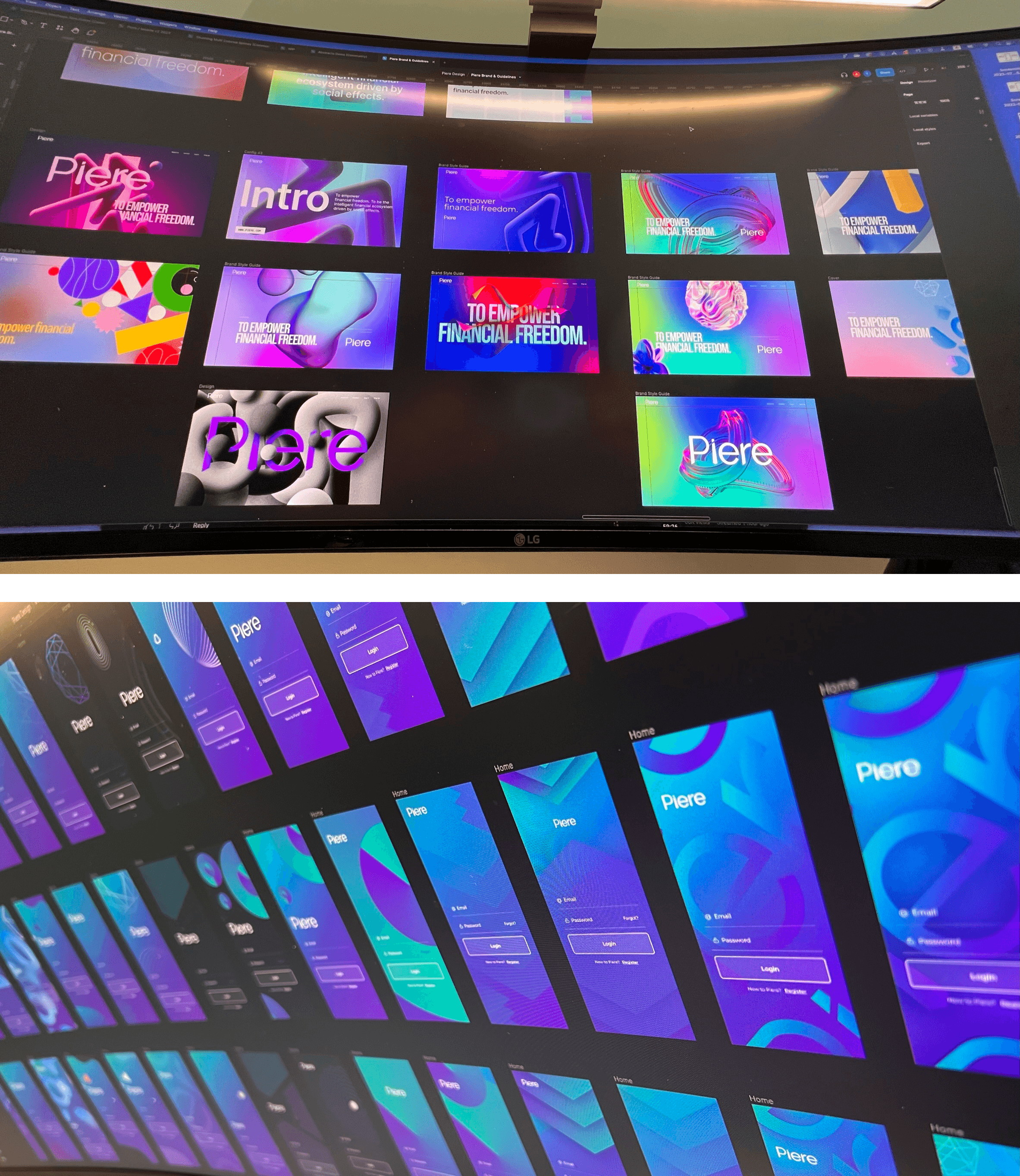
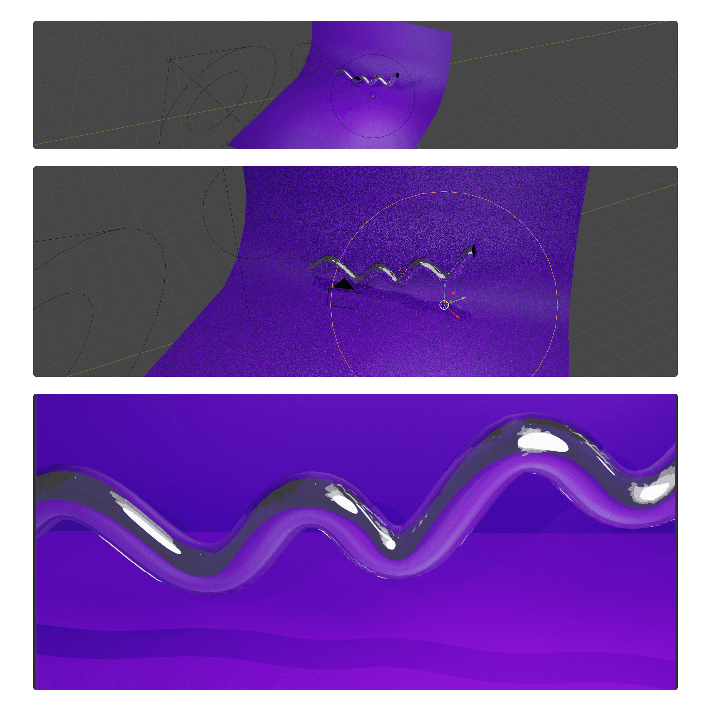
The look of Piere was just as important as the functionality. We chose a bold purple gradient to stand out in a market full of blue finance apps. Rounded cards with glassy layers made the UI feel light and futuristic. Montserrat gave us clarity with a modern edge. Every touchpoint was made to feel fast, tappable, and responsive.




🤝 Collaboration
We worked closely with engineers to simplify complex API calls into lightweight flows. Our product team gathered feedback live from three universities. Remote usability tests through Maze allowed fast iteration. The whole team was aligned — and it showed in how fast we were able to ship, adapt, and refine.
📊 Results
Piere didn’t just look good — it worked. Task completion during the split flow was 37% faster than competitors. Group feature engagement jumped by 42%. Drop-offs decreased by 28%. And feedback from users consistently focused on how “relatable” and “finally stress-free” it felt.
📊 Results
Piere didn’t just look good — it worked. Task completion during the split flow was 37% faster than competitors. Group feature engagement jumped by 42%. Drop-offs decreased by 28%. And feedback from users consistently focused on how “relatable” and “finally stress-free” it felt.


